
How we make premium work feel human
What premium means to us, and how we bring strategy, personality, and polish together without sanding the life out of an idea.
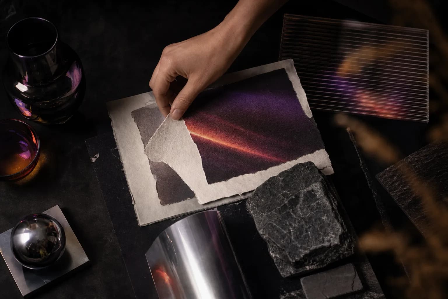
“Make it feel premium” sounds like a clear direction until everyone starts describing what premium looks like to them. One person sees quiet neutrals and a lot of white space. Someone else sees bold type, glossy product shots, and motion everywhere.
That is usually where our work begins. We are not trying to paste a high-end look onto a brand. We are trying to figure out what quality, confidence, and care should feel like for this specific business and the people it needs to reach.
Because work can be spotless and still feel empty. It can follow every design rule and leave you with nothing to remember. We want the polish, but we also want the personality that made the project worth doing in the first place.
We start with what should feel true
Before we talk about typefaces, transitions, or camera angles, we try to get honest about the job. What should someone understand? What should they feel? What should they do next? And just as important, what would feel completely wrong for this brand?
Those questions give us something more useful than a mood board full of expensive-looking references. They give us a point of view. A skincare launch might need to feel tactile and optimistic. A technology company might need to make something complex feel calm and credible. Both can feel premium, but they should not look or sound like the same company.
Once that direction is clear, every creative choice has a reason to exist. We can push where the brand needs energy and pull back where the audience needs clarity.
Then we look for the thing with a pulse
Most projects have an early idea that feels a little dangerous because it does not look like everything else yet. It might be a strange composition, a blunt headline, a rough piece of footage, or a visual detail pulled from the product itself. That is often the part worth paying attention to.
We do not keep something just because it is weird. Different is not automatically good. But when an unexpected choice makes the story clearer or the brand more recognizable, we protect it while the rest of the work gets refined.
This is the part of the process that takes judgment. The goal is not to make everything louder. It is to find the one or two choices that give the work its identity, then give those choices enough room to land.
Character and clutter are not the same thing
Keeping the personality does not mean keeping every idea. In practice, much of our job is editing. We remove the extra line of copy, the fourth type style, the animation that slows down the page, or the shot that looks beautiful but interrupts the story.
We ask a simple question: is this helping the idea, or is it asking for attention? If it helps, we sharpen it. If it is only there to show off, it probably goes.
That edit is how the work starts to feel confident. Not empty. Not overworked. Just clear enough that the strongest parts can do their job.
The medium changes. The thinking does not.
In a brand system, this approach means building enough structure to stay recognizable without forcing every piece to look identical. The voice, type, color, and image direction have rules, but the rules leave room for the brand to respond to different moments.
On a website, it means creating hierarchy before adding motion. We want people to know where they are, why they should care, and where to go next. Animation can add presence, but it should never make someone work harder to use the site.
On a film or photo set, it means arriving with a clear direction and still paying attention when something better happens in front of the camera. The plan keeps the work focused. The room to react keeps it human.
We show the work before it feels precious
Creative work gets better when there is room to talk about it honestly. We like to share the thinking while the work is still flexible enough to change. That lets a client bring in the context only they have, and it keeps us from polishing the wrong answer in private.
The rough stage is not always pretty. That is fine. A project does not need to look finished to prove that the idea is right. We would rather have a direct conversation early than stage a big reveal around something that missed the point.
Once the direction is working, we get obsessive about the finish. Spacing, pacing, copy, responsive behavior, image treatment, and the small moments people may not consciously notice all add up. Polish matters most when it is supporting a strong idea.
The gut check before we call it done
At the end, we come back to a few questions. Does this feel like the client, or could any company use it? Is the main idea obvious without being predictable? Does every polished detail help the experience? Is there still something here that makes us want to look twice?
If the work is beautiful but anonymous, it is not finished. If it has personality but cannot do its job, it is not finished either.
The balance lives between those two outcomes: thoughtful, useful, and refined, with enough life left in it to feel real. That is what premium without sterile means to us, and it is the standard we bring to every project.